E.g : Floating an Image inline with some series of text
<html>
<head>
<title>Floating an Element</title>
<style type="text/css">
p {
float: left;
margin: 3px;
padding: 1px;
}
</style>
</head>
<body>
<p><img src="http://www.phcityonweb.com/images/futurama.jpg" width="300" height="170" />
This is how images are floated, as you can see, the images has been floated to the left
 side of the browser. if you look at it again, you can see how the text wraps around the
image and streams nicely around it. the image doesn't block or interfere with the written
text. so more text can be added inline with the images and displayed properly. This works
well if both the text and the floated image are in a single element. look at the code
at the example and see how you to can float an image inline with some text on your
web page.
</p>
</body>
</html>
It will look like this on your Browser
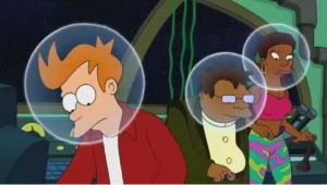 This is how images are floated, as you can see, the images has been floated to the left side of the browser. if you look at it again, you can see how the text wraps around the image and streams nicely around it. the image doesn’t block or interfere with the written text. so more text can be added inline with the images and displayed properly. This works well if both the text and the floated image are in a single element. look at the code at the example and see how you to can float an image inline with some text on your web page.
Can you see how that work, elements are floated horizontally, that means they can only be floated either left or right. a floated element can move as far to the left or right of the containing element as given in the example above.
Floating Series of Images
With the Float property and value, you can float images and position them in a more proper manner, the float property values are either “Left or Right” and with this you can push an images to the far left or right of a containing element.
E.g. Image Gallery using Float.
<html>
<head>
<title>Floating an Element</title>
<style type="text/css">
p {
float: left;
margin: 2px;
padding: 1px;
}
p.right {
float: right;
margin: 2px;
padding: 1px;
}
</style>
</head>
<body>
<P>
<img src="http://www.phcityonweb.com/images/Futurama1.jpg"
width="200" height="120" /></p>
<p class="right">
<img src="http://www.phcityonweb.com/images/Futurama2.jpg"
width="200" height="120" /></p>
See how the images here are both floated left and right of the browser screen,
this is how it would render on a browser if done. image floating enables you to
push an image in the right direction in flow with your text. in this example we've
placed four images for them to be displayed both left and right of the screen.
see the code above to learn more.
<p>
<img src="http://www.phcityonweb.com/images/Futurama3.jpg"
width="200" height="120" /></p>
<p class="right">
<img src="http://www.phcityonweb.com/images/Futurama4.jpg"
width="200" height="120" /></p>
To make this stand out correctly, we've added some random text after the images that
 has been floated. since all images are either floated left or right, you can see that
the text is in the middle of both sides of images and it wraps itself around it.
</body>
</html>
It will look like this on your Browser
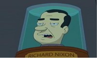
See how the images here are both floated left and right of the browser screen, this is how it would render on a browser if done. image floating enables you to push an image in the right direction in flow with your text. in this example we’ve placed four images for them to be displayed both left and right of the screen. see the code above to learn more.


To make this stand out correctly, we’ve added some random text after the images that has been floated. since all images are either floated left or right, you can see that the text is in the middle of both sides of images and it wraps itself around it.
If you look at the images above, you can see how floating works, the first two images were floated left and right and the other two images were floated left and right as well. but see how nicely arranged it turned out to be. Floating is good when you’re displaying images and text together and want it to render nicely.
Turning Off Float – Using Clear Property
When elements are floated and some series of text are written just below it, those text will be floated according to how those elements have been floated, just as in the example above, both images floated left and right, the text written flowed in context to the direction of both images, to make this float in one direction or not to flow in both direction, the “Clear Property value is employed”.
E.g. clear: left|right|inherit|both|none;
these are the values that are available for the clear property.
<html>
<head>
<title>Floating an Element</title>
<style type="text/css">
p {
float: left;
margin: 2px;
padding: 1px;
}
p.right {
float: right;
margin: 2px;
padding: 1px;
}
p.clear{
clear: both;
margin: 2px;
}
</style>
</head>
<body>
<P>
<img src="http://www.phcityonweb.com/images/Futurama1.jpg"
width="200" height="120" /></p>
<p class="right">
<img src="http://www.phcityonweb.com/images/Futurama2.jpg"
width="200" height="120" /></p>
<p class="clear">Check the same example above and compare it with this one,
here the text has been cleared using the clear property CSS rule and see how it is
displayed on it's own after the floated images.</p>
<p>
<img src="http://www.phcityonweb.com/images/Futurama3.jpg"
width="200" height="120" /></p>
<p class="right">
<img src="http://www.phcityonweb.com/images/Futurama4.jpg"
width="200" height="120" /></p>
<p class="clear">Using the clear property makes it easier when you do not want
the text to wrap itself around the floated images, if you want the text to just stand
on it's own then you can employ this method.</p>
</body>
</html>
It will look like this on your Browser


Check the same example above and compare it with this one,
here the text has been cleared using the clear property CSS rule and see how it is displayed on it’s own after the floated images.


Using the clear property makes it easier when you do not want the text to wrap itself around the floated images, if you want the text to just stand on it’s own then you can employ this method.
When working with float try a combination of any of the CSS syntax you’ve learn so far and see what effect you can create.
| Back | Main: CSS Programming | Previous Lesson: Margin & Padding | Next Lesson: Positioning of Elements |


